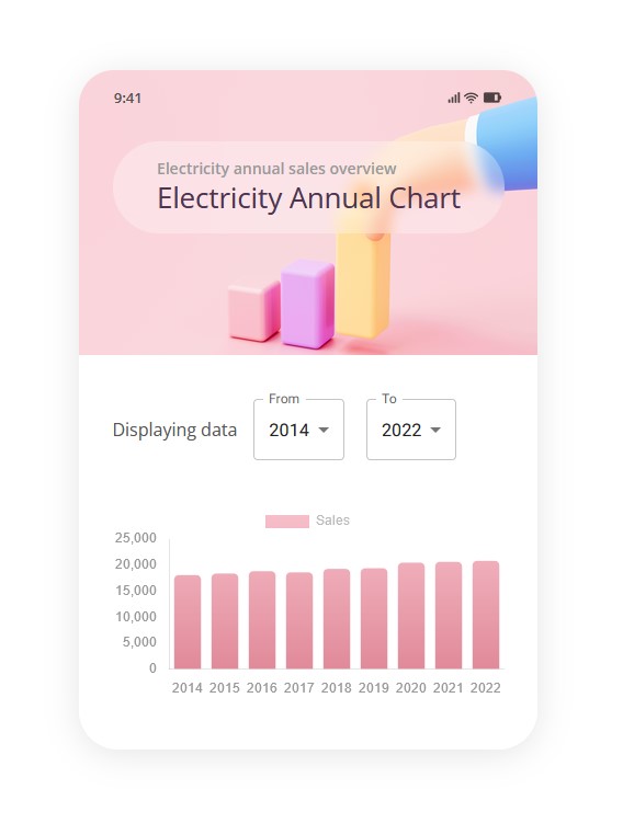
Data visualization is an essential tool for understanding complex information, and it plays a significant role in UI design. Whether you're working on dashboards, reports, or interactive data tools, the way data is presented can make a huge difference in user comprehension and decision-making. As a designer, your goal is to not only display data but also ensure it is presented in a clear, engaging, and actionable way. There are several important aspects to consider when designing data visualization UI.
1. Clarity Over Complexity
Data can often be overwhelming, especially when it involves large datasets. One of the fundamental principles of data visualization design is clarity. Avoid cluttering the interface with too many elements or excessive detail. Focus on delivering the most critical insights without overwhelming the user with unnecessary data points.
- Prioritize Key Information: Highlight the most important data that the user needs to make decisions. For example, in financial apps, display key metrics like profit margins or account balances at the top of the screen.
- Simplify Complex Data: Use clear labels, straightforward charts, and intuitive graphs that represent the data clearly. Avoid unnecessary visual effects or too many colors that may distract the user.
2. Data Integrity and Accuracy
When dealing with data, accuracy is paramount. A user may make important decisions based on the visualized data, so ensuring that it is correctly represented is crucial.
- Choose the Right Chart Type: Use the appropriate type of chart or graph for the data. Bar charts, line graphs, and pie charts all have specific uses. For example, line graphs are great for showing trends over time, while pie charts are better suited for showing proportions.
- Maintain Consistency: Ensure that color schemes, axis labels, and data points are consistent across the entire interface. Any changes in data presentation style or format can confuse users and reduce trust in the tool.
3. Interactivity and User Control
An interactive data visualization allows users to engage directly with the data, providing them with a more personalized experience.
- Filters and Drilldowns: Offer the ability to filter or drill down into specific subsets of data. This allows users to explore different aspects of the information based on their needs.
- Tooltips and Annotations: Interactive tooltips and annotations can help users understand what specific data points mean when they hover over a particular part of the graph. These elements can provide additional context without cluttering the visualization.
- Responsive Design: Ensure that your data visualization is responsive and works seamlessly across devices. Whether a user accesses it on desktop, tablet, or mobile, the interaction should remain smooth and intuitive.
4. Color and Visual Hierarchy
Color plays a crucial role in data visualization design. It can be used to highlight key data, show trends, or categorize information.
- Use Color Strategically: Select a color palette that’s easy to distinguish. For example, use contrasting colors to indicate different categories or positive vs. negative changes. Avoid using too many bright colors that can overwhelm the user.
- Ensure Accessibility: Not all users perceive colors in the same way. Consider colorblind-friendly palettes and ensure that your visualizations are still comprehensible without relying solely on color differences. Tools like color contrast checkers can be helpful.
5. Contextualization
Presenting raw data without context can lead to confusion. It's essential to provide users with context to make sense of the information.
- Include Legends and Labels: Clearly label axes, categories, and other relevant data points. A chart without a title or axis labels can leave users guessing about what the numbers represent.
- Provide Benchmarks or Comparisons: In some cases, showing how the current data compares to previous performance or industry benchmarks can help users understand its significance. This can be done with reference lines, averages, or comparison bars.
6. Performance and Load Times
Heavy data visualizations can affect performance, especially when dealing with large datasets. Slow load times can frustrate users and negatively impact the user experience.
- Optimize for Speed: Ensure that your visualizations load quickly by optimizing code, images, and datasets. Implement lazy loading for large datasets or use aggregations to speed up the initial load time.
- Ensure Smooth Transitions: Implement smooth animations and transitions when data is updated or when users interact with the visualization. This enhances the user experience and ensures the UI feels responsive.
7. Consistent Layout
A well-structured layout helps guide the user’s eye and makes it easier to digest complex data.
- Create Logical Groupings: Group related data together to help users understand how different data points relate to one another. Use spacing, boxes, or grids to visually separate different types of data.
- Balance Detail and Overview: Provide both a high-level overview and an option for more detailed insights. For instance, a dashboard might show key performance indicators (KPIs) at a glance but allow users to drill into deeper metrics.
Conclusion
Designing data visualizations is a delicate balance between aesthetics, usability, and functionality. By focusing on clarity, accuracy, interactivity, and context, designers can create effective data visualizations that not only look appealing but also enable users to make informed decisions. When done right, data visualization UI design can transform complex datasets into meaningful insights, ultimately enhancing the user experience and business outcomes.
